Nobody designs for small iPhone devices anymore
Nobody designs for small iPhone devices anymore. Why do I say this? Well, if you've been rocking the iPhone SE 2020 you would know. What I'm saying is there a lot of UI glitches from apps running on iPhone SE.
Clubhouse
Forgot to measure the screen's width?
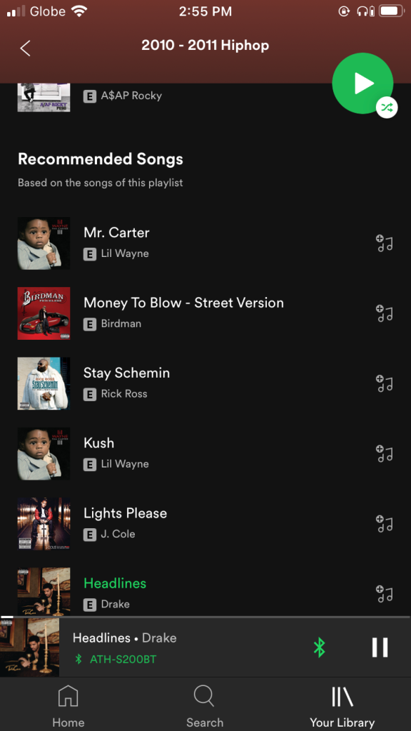
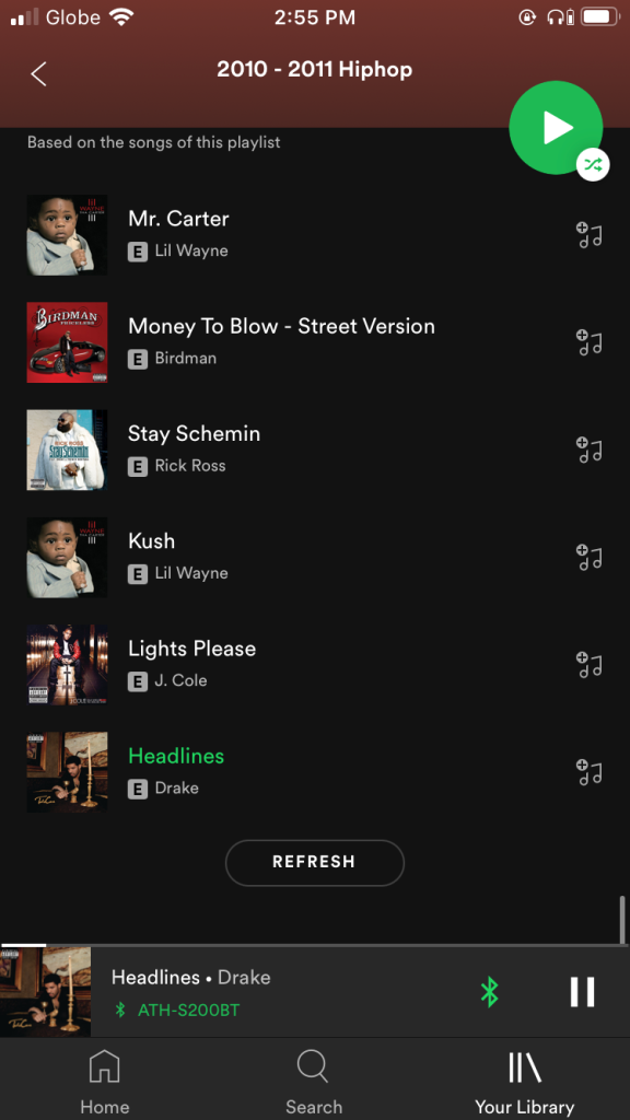
Spotify
I can't see the Refresh button. I have to scroll up with my left thumb and then tap Refresh on my right. Smh.
Globe Telecom
If you can take a look at the bottom TabBbar. Labels are cut off.

Navigation bar is too large.
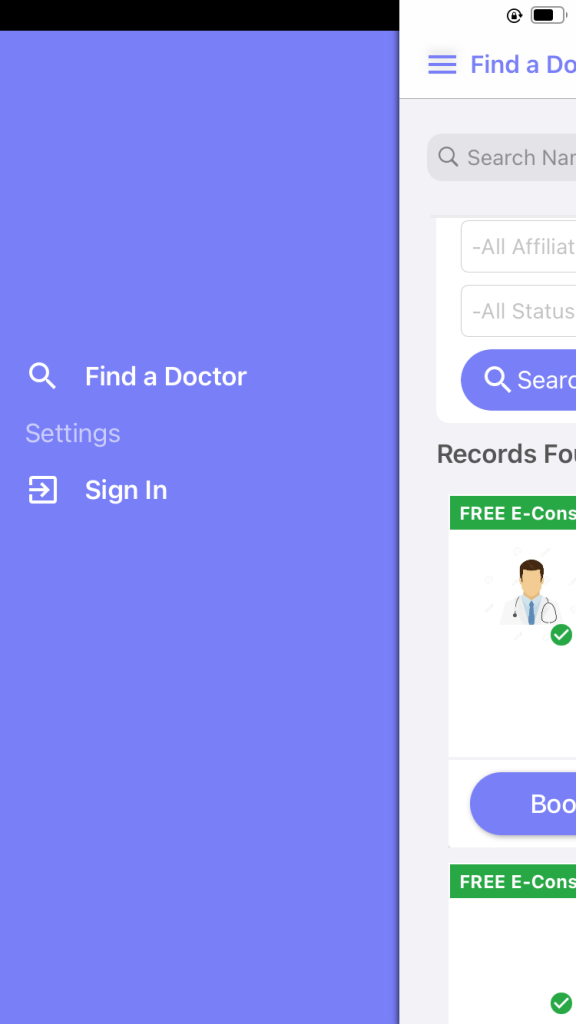
CloudMd
A little padding at the top on the menu.
Foodpanda
Too much white space padding at the top and the letters p and y on the Balance and payment methods are cut off.

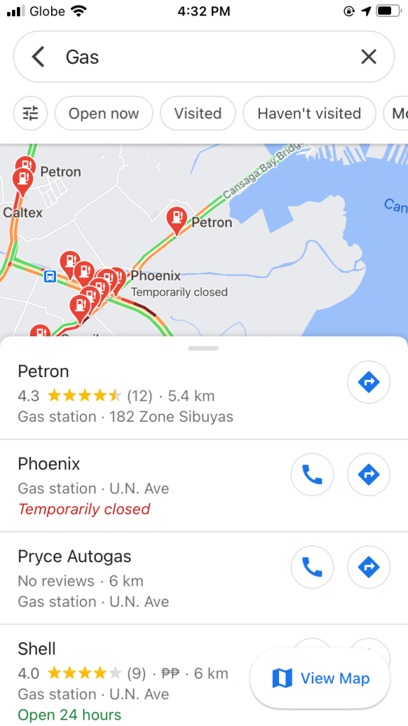
Google Maps
Dang I can barely see the map.
Headspace
What's up with them navigation bars?

I forgot but some local bank app
So many white spaces and concatenated Label. Too large fonts for my small ass phone.
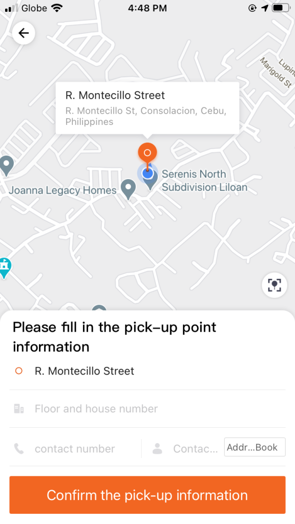
Lalamove
My Drive logo all stretched out. Maybe check the AutoLayout constraints?
Contact word shouldn't be too long right? And Address Book button why are you even there?
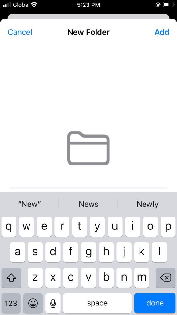
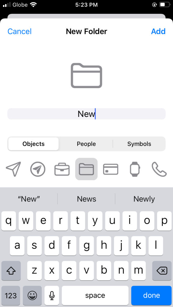
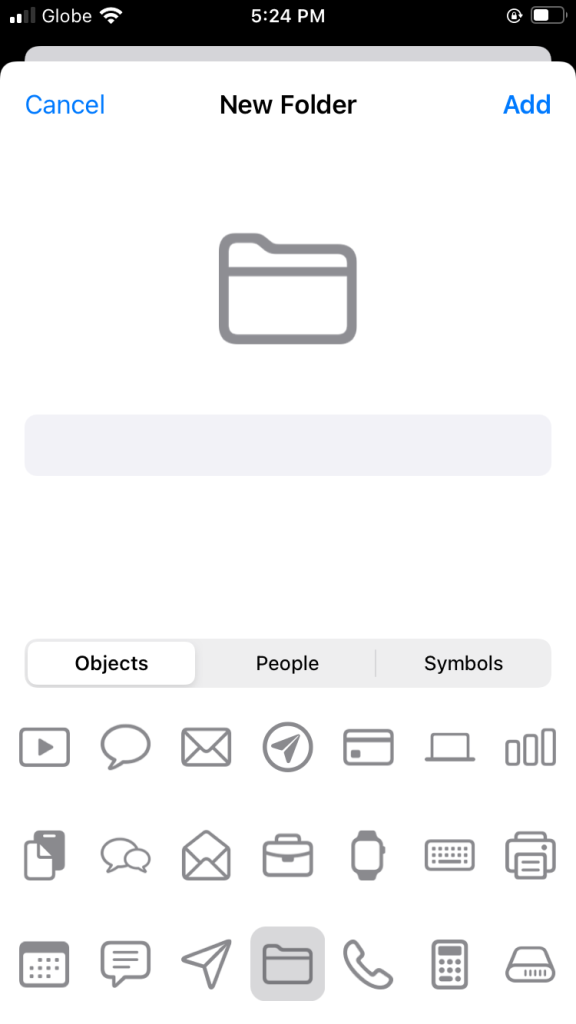
Apple Shortcuts
Dang how can I enter the folder name? Smh.
Medium
Navigation bar seems a little off. Too much white space for my small ass phone.

There's too much padding on the navigation bar. For me it's too much for my small phone and big thumb.
Apple TV
Too much header space don't you think? I know the logo is perfectly done but how about conserving space.

Those are just some of the examples. I'm just too tired uploading it all. Also I might hit my blog GB limit.
As an iOS developer, I always pride myself in starting design and development using the smallest phone and screen size because it is easier to scale upwards than to scale downwards. Also, I don't care if the statistics for small devices is less than 1%, it's just pure respect for those users.
Maybe Apple should test on smaller devices before accepting the app on the App Store.